


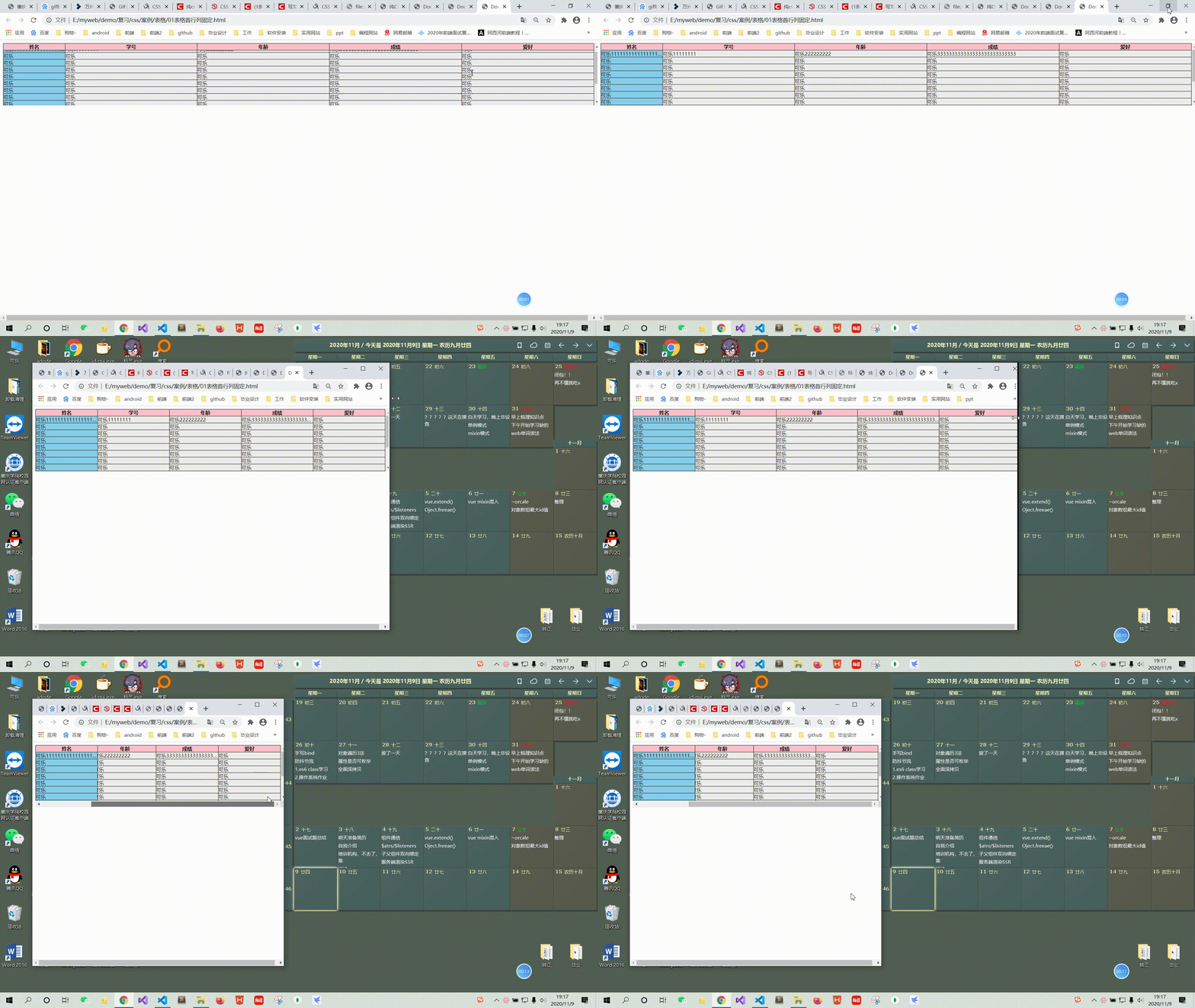
今天校招笔试题要求实现一个首行首列固定,宽度自适应窗口变化,但窗口缩小到一定宽度不能再缩小,出现水平滚动条…
当时我写错了,我一时想不起改用什么办法首行首列固定,用绝对定位,父亲相对定位…这样会有很多问题要解决…
所以回来我学了一下,以前教程没学过这些属性,涨知识了哈哈…
先了解几个概念:
table-layout:
table-layout属性有两种特定值:
auto(预设值)-表格的总宽度决定每一个储存格(cell)的最大值
fixed - 表格的总宽度决定于表格width的定义,以及各栏位(column)width的定义, 没有定义宽度就平分表格宽度。
表格宽度通过表格的宽度来设置,某一列的宽度仅由该列首行的单元格决定,其他行单元格的宽度不会影响整列的宽度。
注意:自定义宽度要定义在首个单元格才有效果(th)
position : sticky
粘性定位可以被认为是相对定位和固定定位的混合。元素在跨越特定阈值前为相对定位,之后为固定定位。
在目标区域中可见时,他的行为就像relative 不会有任何变化,而当页面滚动超出目标区域时,他的表现改为fixed会固定于目标位置
sticky元素会“固定”在离它最近的一个拥有“滚动机制”的祖先上(当该祖先的overflow是hidden、scroll、auto、overlay时), 即便这个祖先不是最近的真实可滚动祖先。
要注意的是当position : sticky应用于table,只能作用于th和td,作用tr没有效果,并且一定要定义目标位置 left / right / top / bottom 才会出现固定效果!
实现:
1.自适应
表格外包一层div,宽度100% ,溢出出现滚动条
.box {
      width: 100%;
      height: 200px;
      background-color: #eee;
      overflow: auto;
margin: 10px;
    }
表格table, 宽度100%, 设置一个最小宽度,我这里设置1000px,这个根据个人设定哈
table {
      width: 100%;
      min-width: 1000px;

      table-layout: fixed;

      border-spacing:0;
    }
2.固定首行首列
需要在首行th 和首列设置粘性定位
首行设置
thead tr th {

      background-color: pink;
      position: sticky;
      top: 0;

 border-top: 1px solid black;
    }
首列设置
 td:first-child {

      position: sticky;
      left: 0;
      background-color: skyblue;
    }
如果需要改变单元格宽度,需要设置table-layout: fixed
这个属性设置了默认单元格平分table宽度,如果首列第一个单元格(th)设置了固定宽度200px,那么这列宽度就是200px
注意是第一个单元格
td:first-child,th:first-child {

  width: 200px;
  border-left: 1px solid black;
    }
还有一个注意地方是 边框border,要单独设定每个单元格边框border, 如果border collapse,滚动会跟着动,效果不好看。
整体代码:
  document

    * {
      padding: 0;
      margin: 0;
    }

    .box {
      width: 100%;
      height: 200px;
      background-color: #eee;
      overflow: auto;
      margin: 10px;
    }
    table {
      width: 100%;
      min-width: 1000px;

      table-layout: fixed;

      border-spacing:0;
    }

    td,th {
      border-bottom: 1px solid black;
      border-right: 1px solid black;
      box-sizing: border-box;

      white-space: nowrap;
      overflow: hidden;
      text-overflow: ellipsis;
    }

    td:first-child,th:first-child {

  width: 200px;
  border-left: 1px solid black;
    }

    td:last-child, th:last-child {
      border-right: 1px solid black;
    }
    th:last-child, td:last-child {
      border-right: 1px solid black;
    }
    .last td {

      border-bottom: 1px solid black;
    }

    thead tr th {

      background-color: pink;
      position: sticky;
      top: 0;

 border-top: 1px solid black;
    }

    td:first-child {

      position: sticky;
      left: 0;
      background-color: skyblue;
    }
    thead tr th:first-child {

      z-index: 1;
      left: 0;
    }


      姓名
      学号
      年龄
      成绩
      爱好


 可乐11111111111111111111111111111111111111111111111111111111
 可乐11111111
 可乐222222222
 可乐333333333333333333333333333
 可乐


 可乐
 可乐
 可乐
 可乐
 可乐


 可乐
 可乐
 可乐
 可乐
 可乐


 可乐
 可乐
 可乐
 可乐
 可乐


 可乐
 可乐
 可乐
 可乐
 可乐


 可乐
 可乐
 可乐
 可乐
 可乐


 可乐
 可乐
 可乐
 可乐
 可乐


 可乐
 可乐
 可乐
 可乐
 可乐


 可乐
 可乐
 可乐
 可乐
 可乐


 可乐
 可乐
 可乐
 可乐
 可乐


 可乐
 可乐
 可乐
 可乐
 可乐


 可乐
 可乐
 可乐
 可乐
 可乐


 可乐
 可乐
 可乐
 可乐
 可乐
效果:(做的还不是很好,继续加油)
到此这篇关于CSS实现表格首行首列固定和自适应窗口的实例代码的文章就介绍到这了,更多相关css实现表格首行首列固定内容请搜索考高分网以前的文章或继续浏览下面的相关文章,希望大家以后多多支持考高分网!


